First things first—approaching banking fresh
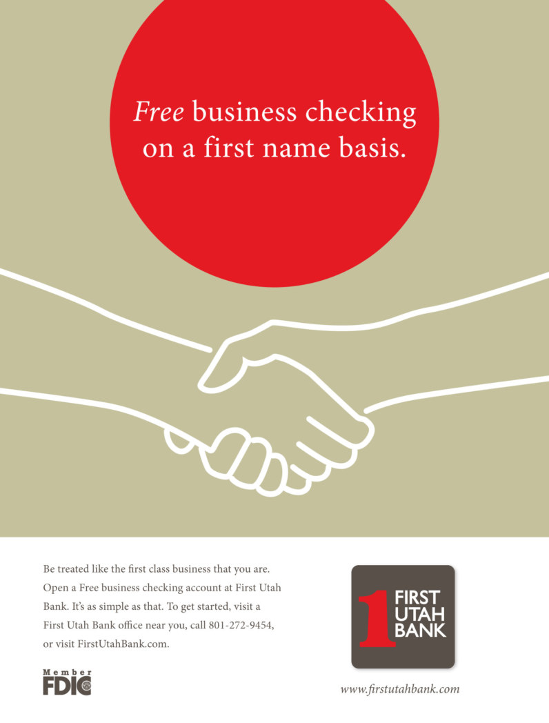
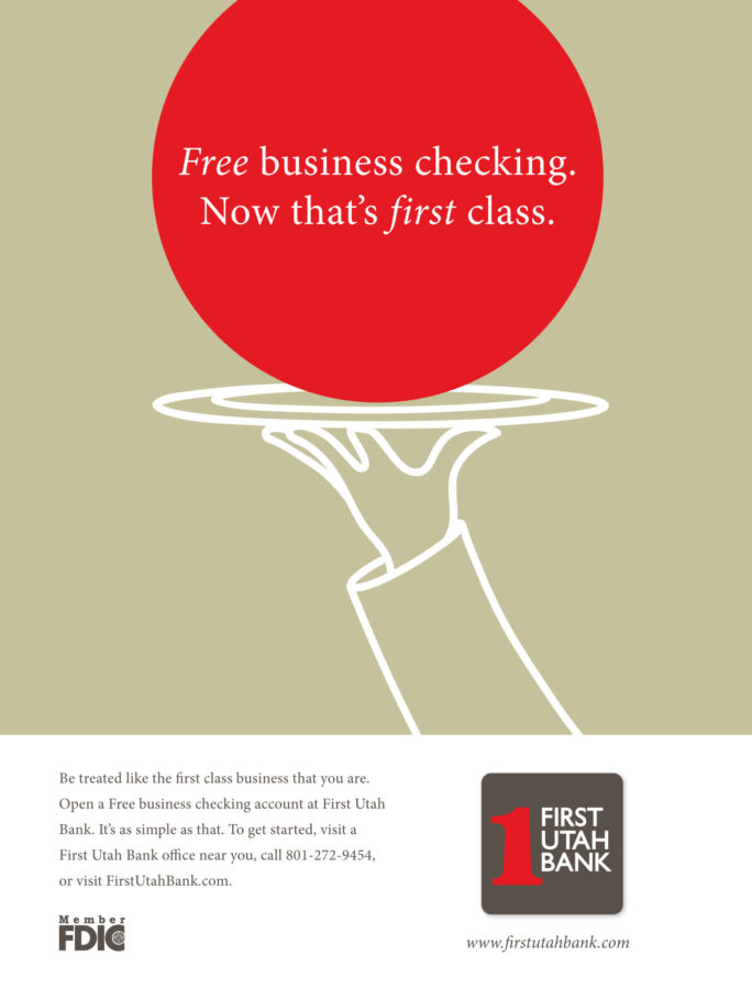
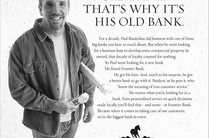
A critical first assignment with our client, First Utah Bank, was to create a cohesive stand-out brand. We began by refreshing and updating the logo and creating a design approach that communicates a capable local bank with a trustworthy personal touch. Employing simple illustrations created a unique look that stands apart from the typical big bank slick stock photo look. Keeping it simple and graphic also helped distinguish First Utah Bank from its competition.
Employing illustrations created a unique look that stands apart from the typical big bank slick stock-photo look. Keeping the design simple and very graphic with headline treatments also helped distinguish First Utah Bank from its competition.
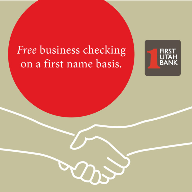
These “free ads” were some of our first utilizing this new branding. The second set of square ads is for Facebook.


